Goals
The aim of this lab was to develop skills in performing key photogrammetric tasks on aerial photographs and satellite images. Specifically, this lab encompassed:
- calculation of photographic scales
- measurement of areas & perimeters
- calculation of relief displacement
- stereoscopy
- orthorectification of satellite images
Methods
Scale Calculation
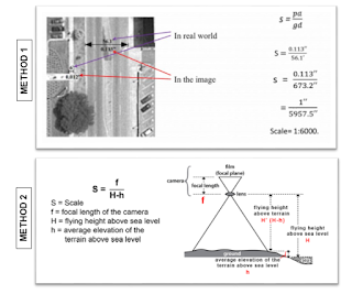
There are two main methods used to calculate the scale of a vertical aerial image:
- Compare size of objects measured in the real world with the same objects measure on a photograph
- Find the relationship between the camera lens focal length and the flying height of the aircraft above the terrain
 |
| Figure 1: diagram depicting two methods of scale calculation |
During the first part of this lab, we explored both of these methods. First, I utilized a ruler and images to measure various distances on my computer monitor. I then used math to compare this measured distance to a given actual distance (mathematical process shown in Figure 1). After this, I applied the second method of scale calculation using given focal length and flying height values for a photo of Eau Claire (mathematical process shown in Figure 1).
Area & Perimeter Measurement
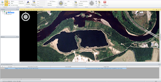
For this part of the lab, I utilized the 'Measure Perimeters and Areas' digitizing tool in Erdas Imagine to calculate the area and perimeter of a given photograph (Figure 2).
 |
Figure 2: calculation lagoon area and perimeter
|
Relief Displacement Calculation
 |
| Figure 3: relief displacement equation |
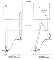
Relief displacement occurs when objects and features on an aerial photograph are displaced from their true planimetric location. Through applying an equation, this distortion can be corrected (Figure 2). During this portion of the lab, I utilized given values to apply the relief displacement equation (Figure 3).
 |
| Figure 4: diagram depicting effect of relief displacement |
Stereoscopy
The aim of this part of the lab was to generate two 3D images first using a digital elevation model (DEM) and then using a digital surface model (DSM). After this, the resulting anaglyph images were analyzed using polaroid glasses.
Anaglyph Creation with DEM
For the first anaglyph image, I used an image of Eau Claire at 1 meter spatial resolution and a DEM of the city at 10 meter spatial resolution. Then, using the Anaglyph function under Terrain on Erdas Imagine, I specified parameters (vertical exaggeration = 1, all other aspects default) in the Anaglyph Generation window and ran the model. This produced the anaglyph shown in the Results section (Figure 12).
Anaglyph Creation with DSM
For the second anaglyph image, I used an image of Eau Claire with 1 meter spatial resolution and a LiDAR-derived DSM of the city at 2 meter spatial resolution. Using the Anaglyph function under Terrain in Erdas Imagine once more, I specified the same parameters as I had for the first anaglyph. After running the model, a second anaglyph was produced, shown in the Results section (Figure 13).
Orthorectification
This part of the lab served as an introduction to the Erdas Imagine Lecia Photogrammetric Suite (LPS), which is used in digital photogrammetry for triangulation, orthorectification of images, and extraction of digital surface and elevation models, among other things. As such, we used LPS to orthorectify images and create a planimetrically true orthoimage. Two orthorectified images were used as sources for ground control measurements, namely a SPOT image and an orthorectified aerial photo. To carry out the orthorectification process, I used this work flow:
- Create new project
- Select horizontal reference source: SPOT image
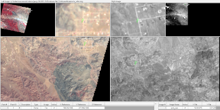
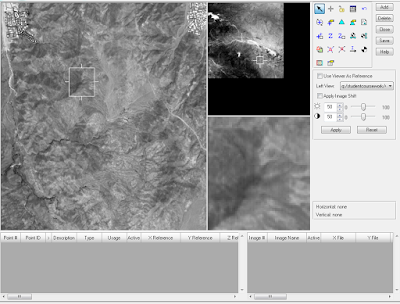
- Collect GCPs (Figure 5, 6)
- Add second image to block file: aerial photo
- Collect GCPs in second image
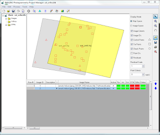
- Perform automatic tie point collection (Figure 7, 8)
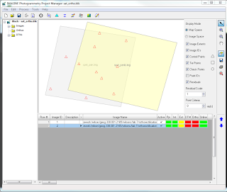
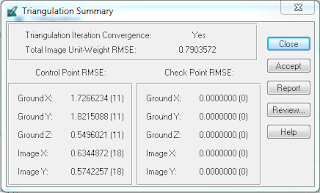
- Triangulate the images (Figure 9)
- Orthorectify the images (Figure 10, 11)
- Orthoimage analysis
 |
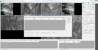
| Figure 5: GCP point collection |
 |
Figure 6: Point Measurement Box displaying GCPs collected from first image
|
 |
| Figure 7: Autotie point collection and summary |
 |
Figure 8: Point Measurement Box displaying GCPs (triangles) and tie points (squares)
|
 |
| Figure 9: Triangulation Summary |
 |
| Figure 10: Orthoimage creation |
 |
| Figure 11: close up of boundary between two orthoimages |
Results
The results of my methods are displayed below.
Anaglyph Creation
When wearing polaroid glasses, the features on both anaglyphs appear more 3D, however, the second anaglyph image displays more of this effect (Figure 12, 13). This could be because the first anaglyph was created using a DEM, which provides more general bare earth features, while the second was created using a DSM, which includes more details like vegetation, buildings, etc. Additionally, the differences between the two images may be because the spatial resolution of the DEM used for the first anaglyph was at 10m and the DSM used for the second anaglyph was at 1m.
 |
| Figure 12: first anaglyph created with DEM |
 |
Figure 13: second anaglyph created with DSM
|
Orthorectification
The orthoimages produced from my methods, when laid over each other, display a high degree of spatial accuracy in the overlap zone (Figure 14).
 |
| Figure 14: final orthoimages overload |
Sources
Digital elevation model (DEM) for Palm Spring, CA is from Erdas Imagine, 2009.
Digital Elevation Model (DEM) for Eau Claire, WI is from United States Department of
Agriculture Natural Resources Conservation Service, 2010.
Lidar-derived surface model (DSM) for sections of Eau Claire and Chippewa are from Eau
Claire County and Chippewa County governments respectively.
National Aerial Photography Program (NAPP) 2 meter images are from Erdas Imagine, 2009.
National Agriculture Imagery Program (NAIP) images are from United States Department of Agriculture, 2005.
Scale calculation image is from Humboldt State University Geospatial Curriculum, 2014.
Spot satellite images are from Erdas Imagine, 2009.
